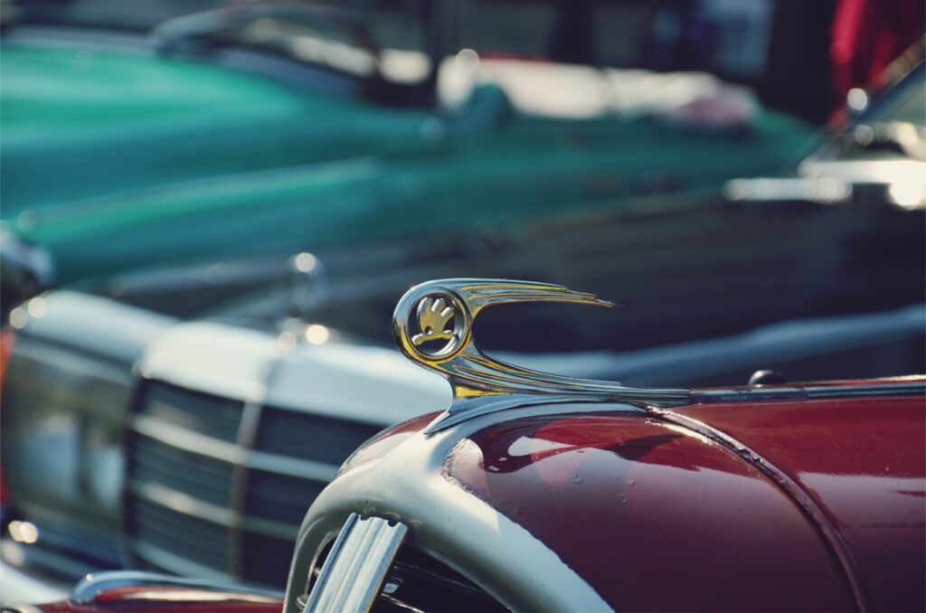
In 1895, Václav Laurin and Václav Klement founded Laurin & Klement as a bicycle manufacturer, which started automobile production in 1905 and later took the name Škoda. Today, as part of the Volkswagen Group, Škoda has used a total of 13 different logos since its foundation. Although the colors in the brand’s logos have changed over time, the winged arrow motif has always remained constant.
In 1925, Laurin & Klement merged with the Pilsen-based engineering company Škoda Works. This merger marked the beginning of a new era for the brand, with the winged arrow logo being introduced for the first time during this period and becoming the symbol of the brand. The winged arrow on the logo symbolizes movement, progress, and innovation. It also represents speed and technology. The circle surrounding the arrow reflects Škoda’s global presence and orientation towards international markets.
Winged Arrow: A Symbol of Movement and Innovation
Over the years, the logo has evolved into a more modern and simpler form, reflecting Škoda’s continuously evolving structure and technological advancements.
The Evolution of the Škoda Logo Over Time
The logo has been modernized over time, becoming more simplified and achieving its current form.
Source: Skoda
