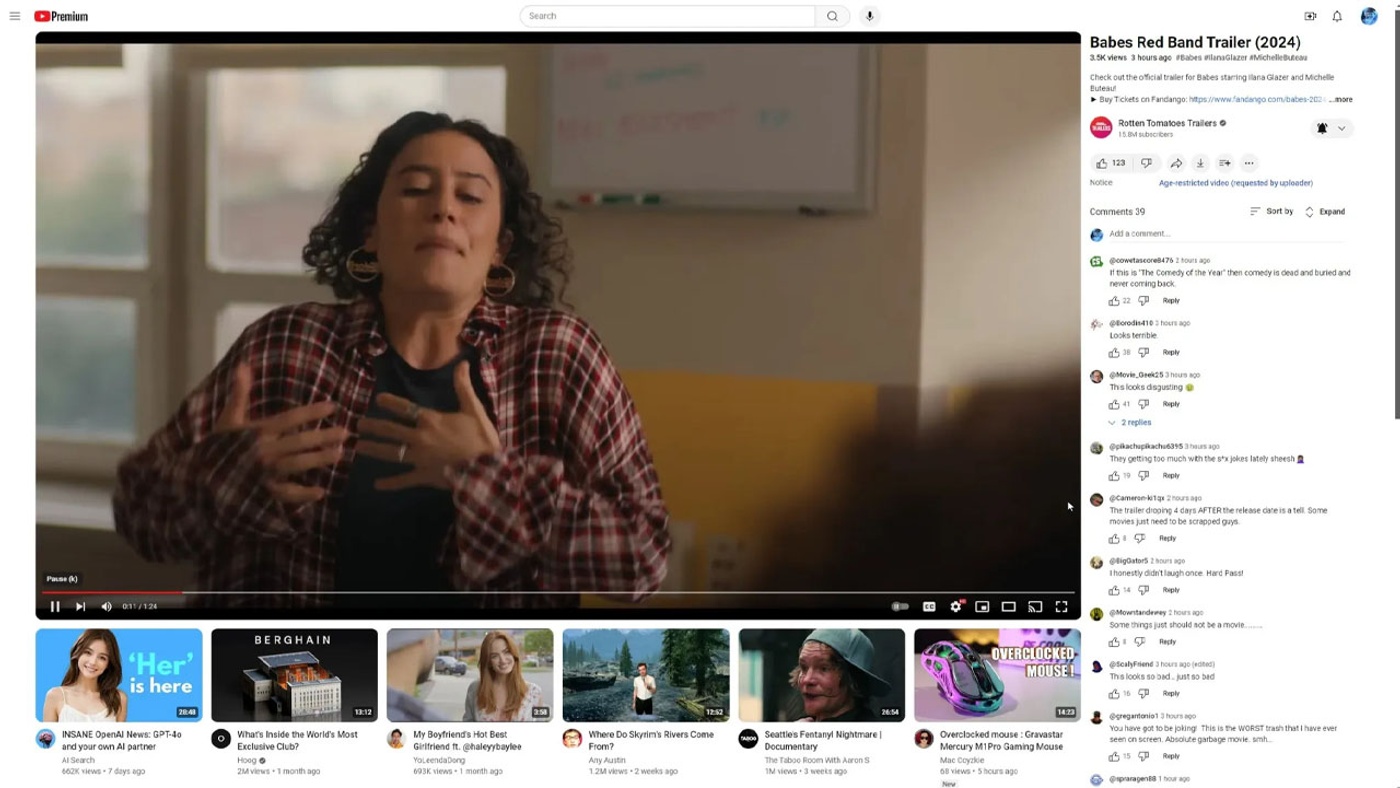
Google continues to experiment with a new design for YouTube, the world’s largest online video platform. This new design was tested a few months ago with a limited number of users and received great reviews. Google then withdrew the design, but now it is on the agenda again. Google’s process of putting the design back into testing has sparked outcry because it was done without adequate notice to users.
This is what YouTube’s new design will look like

In the new design, videos will have a larger viewing area and the title and description will be moved to the right side of the screen. There will also be a suggested videos section below the video. These changes can have a significant impact on users’ perception and engagement with content.
While there is no definitive statement from Google at the moment, it seems that the company is looking for more user feedback. YouTube users continue to voice their concerns and criticisms about the new design. It remains to be seen how Google will respond to this feedback and whether it will make the design permanent.


