


YouTube is testing a new interface for Android users aimed at reshaping the video watching experience. This design significantly differs from the current version and could change some user habits. In the new interface, video titles will now be displayed in a different location instead of the upper left corner. Additionally, interactive elements such as like, dislike, and comment buttons will be moved from the bottom left of the playback bar to the upper right.
What Will YouTube’s Innovative Video Viewing Interface Look Like?
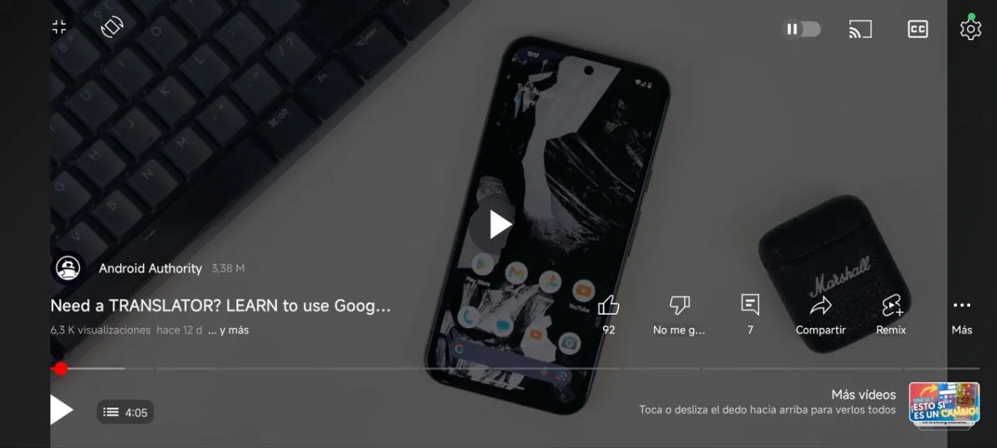
These changes aim to offer users a cleaner and simpler interface. However, those accustomed to the current design may find this new layout initially confusing or uncomfortable. Feedback, especially on social media platforms like Reddit, is generally negative. Users express concerns about adapting to the location changes and the overall flow of the design.
It is still uncertain whether Google will take this feedback into account. However, the tech giant will continue to conduct such experiments to continuously improve user experience. Ultimately, YouTube’s new video playback interface could significantly affect how the platform is used and further personalize the user experience.